Østergade 21

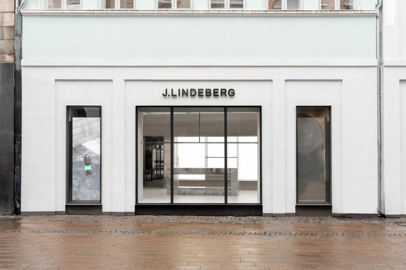
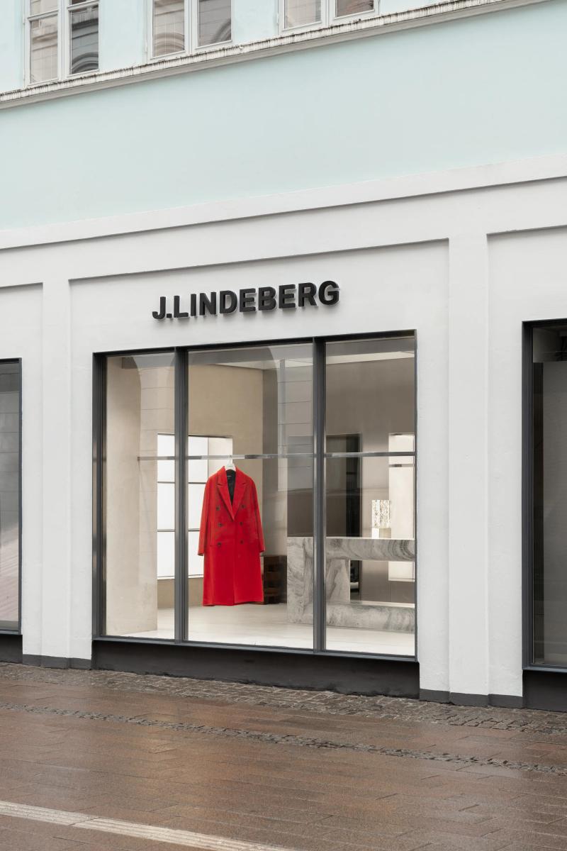
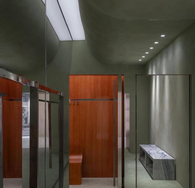
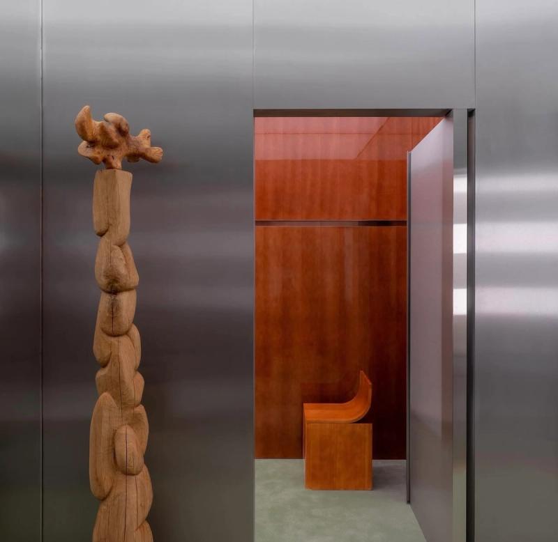
Östergade 21 sits on one of Copenhagen's busiest pedestrian streets, but the moment you step through the entrance, the noise falls away. The facade is deliberately restrained — dark framing against the old building's stonework , so the interior does the talking. Inside, the 150-square-metre space opens up around a central axis that pulls you from the street-facing windows all the way to the back wall, where a slatted oak installation catches the light and gives the store its visual anchor.
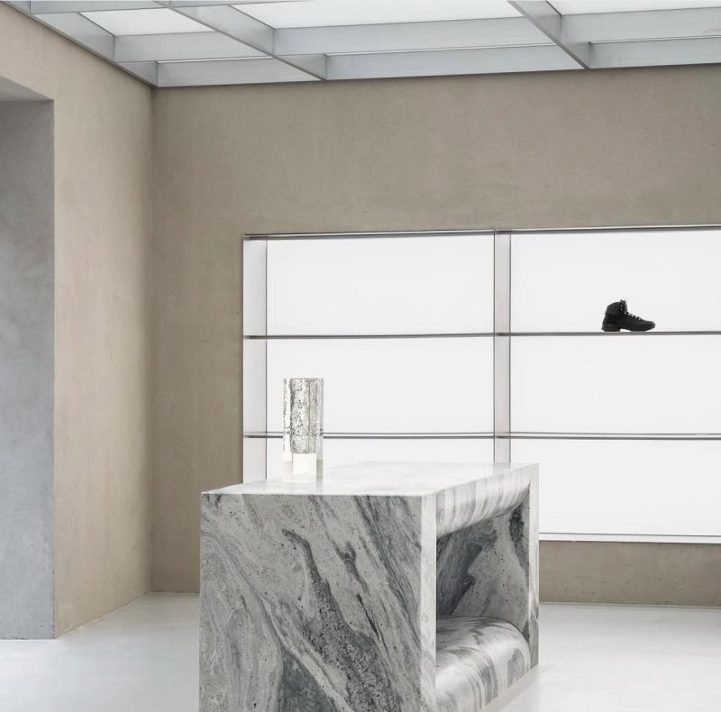
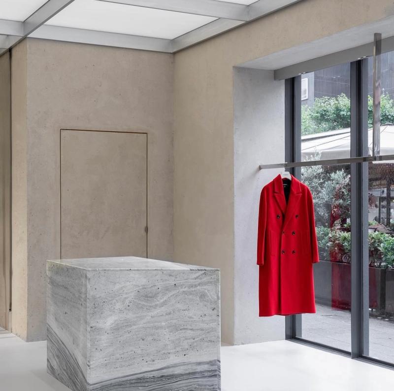
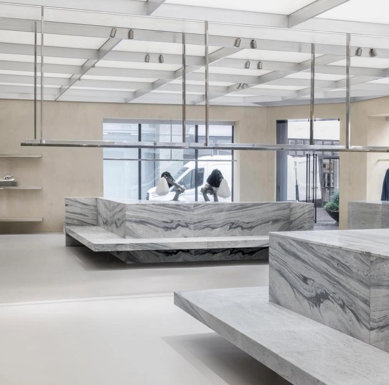
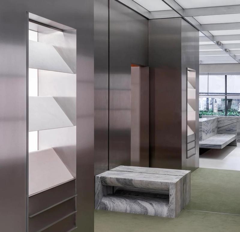
The material palette reads like a conversation between Scandinavian restraint and something rougher, more urban. Poured terrazzo flooring in a warm grey tone runs throughout, meeting walls finished in raw plaster that's been left deliberately imperfect — you can see the trowel marks if you look closely. Brass fixtures and clothing rails add warmth without tipping into luxury-for-luxury's-sake territory. The fitting rooms are tucked along one side behind heavy linen curtains, each one lined in smoked mirror and lit from above with a soft, diffused glow that actually makes you look good. It's a small detail, but it matters.
What Thibaut Allgayer's design gets right here is pacing. The front of the store is open and edited — a few key pieces on freestanding racks, breathing room between each one. As you move deeper, the density increases. Shelving units in blackened steel hold folded knits and accessories, and the ceiling drops slightly, creating a more intimate zone that feels almost residential. The lighting shifts too, from bright and clean near the windows to warmer pools further in. It's a store that rewards you for exploring, and that understands the difference between showing clothes and selling a feeling. J.Lindeberg's Copenhagen flagship doesn't shout. It doesn't need to.
▪Location
Copenhagen, Denmark
▪Sector
retail
▪Services
flagships, concept-store
▪Type
J.Lindeberg Flagship Store
▪Surface
150 m²
▪Creative Director
Thibaut Allgayer
▪Project Manager
Tomai Nordgren
▪Palette
Base
#59564A
Secondary
#98928B
Highlight
#E1E3E2
Accent
#937B6A
Østergade 21 reads as compact but deliberate. In Copenhagen, the plan keeps circulation clear so the room can stay quiet even when it is active. Materials do most of the speaking: wide-plank oak, brushed stainless steel, and matte painted walls that keep reflections controlled. The project keeps the brief grounded in use: Östergade 21 sits on one of Copenhagen's busiest pedestrian streets, but the moment you step through the entrance, the n. The result is observational and precise. Nothing asks for attention, but everything is legible once you slow down.
The sequence feels edited rather than sparse. You move through Østergade 21 without friction, and each surface carries enough weight to hold the eye. Junctions are clean and repeatable, which gives the small shifts in material a stronger effect. The project keeps the brief grounded in use: Östergade 21 sits on one of Copenhagen's busiest pedestrian streets, but the moment you step through the entrance, the n. What stays with you is restraint. The project avoids gestures and leans on proportion, texture, and sequence instead.
At Østergade 21, the layout works like a measured script. The room gives you one clear line of movement, then lets details accumulate at the edges. Junctions are clean and repeatable, which gives the small shifts in material a stronger effect. The project keeps the brief grounded in use: Östergade 21 sits on one of Copenhagen's busiest pedestrian streets, but the moment you step through the entrance, the n. It lands through control, not spectacle. Proportion and material contrast carry the atmosphere from one frame to the next.
▪Spatial Priorities
Circulation clarity
Movement routes are kept legible so browsing, service, and dwell zones do not compete.
Sightline control
Displays and focal points are arranged to maintain visibility while preserving rhythm through the space.
Lighting hierarchy
Ambient, focal, and task lighting are balanced so materials read correctly without flattening depth.
▪Material Notes
Key Materials
Material cues referenced in the project text: Oak, Terrazzo, Stainless Steel, Brass, Mirror, Plaster.
Color Reference
Image-derived palette baseline: Base #59564A, Secondary #98928B, Highlight #E1E3E2, Accent #937B6A. Use as a visual reference and validate against material samples on site.
Finish Notes
Keep finish notes practical: identify high-touch surfaces, wear-prone edges, and cleaning-sensitive materials.
▪Delivery Scope
Concept Development
Spatial concept, layout direction, and design intent framing.
Material & Finish Specification
Selection and documentation of key finishes, fixtures, and surfaces.
Art Direction
Visual consistency across touchpoints, detailing, and spatial expression.
Merchandising / Display Logic
Display zones and fixture priorities coordinated with circulation and visibility.
Related projects