& Agency

The agency space is designed for both focused work and informal exchange. Shared tables sit along the brightest edge, while quieter zones are placed deeper in plan where acoustics are softer and visual distractions are lower. The layout reads quickly: collaboration in front, concentration behind, support spaces at the perimeter.
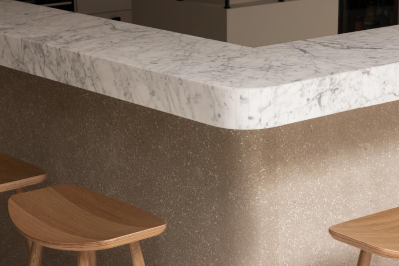
Materials are practical but tactile. Oak worktops bring warmth at touch points, powder-coated steel handles daily wear, and felt-backed elements reduce reverberation in open areas. Lighting is layered to avoid glare on screens while keeping faces readable in meetings and casual conversations.
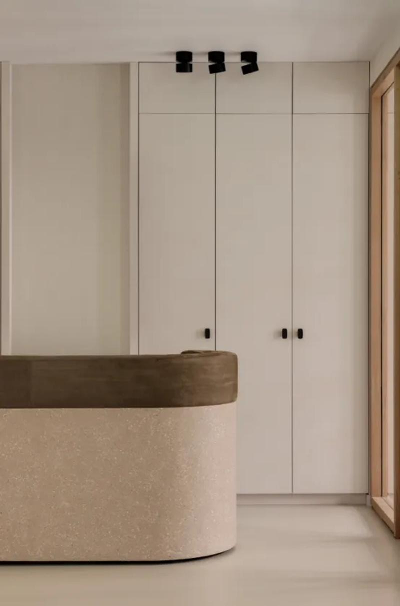
Storage is integrated rather than added later. Built-in units align with structural lines, and circulation remains clear even at peak occupancy. The atmosphere stays composed and usable throughout the day, which is exactly what this kind of workplace needs.
▪Location
Amsterdam, Netherlands
▪Sector
hospitality, art-direction
▪Services
office, brand-spatial-identity
▪Type
& Agency
▪Palette
Base
#7D6853
Secondary
#AB9B8D
Highlight
#C7BAAE
Accent
#5F4A35
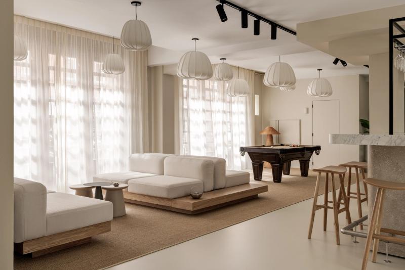
& Agency reads as compact but deliberate. In Amsterdam, Netherlands, the plan keeps circulation clear so the room can stay quiet even when it is active. Materials do most of the speaking: wide-plank oak, brushed stainless steel, and matte painted walls that keep reflections controlled. The project keeps the brief grounded in use: This interior cultivates a sense of effortless gathering where shared moments unfold in a calm, neutral landscape shaped. The result is observational and precise. Nothing asks for attention, but everything is legible once you slow down.
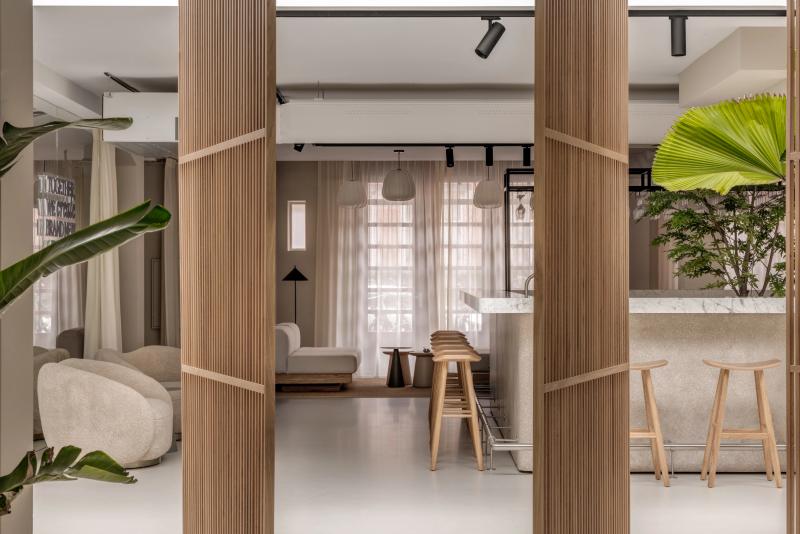
The sequence feels edited rather than sparse. You move through & Agency without friction, and each surface carries enough weight to hold the eye. Junctions are clean and repeatable, which gives the small shifts in material a stronger effect. The project keeps the brief grounded in use: This interior cultivates a sense of effortless gathering where shared moments unfold in a calm, neutral landscape shaped. What stays with you is restraint. The project avoids gestures and leans on proportion, texture, and sequence instead.
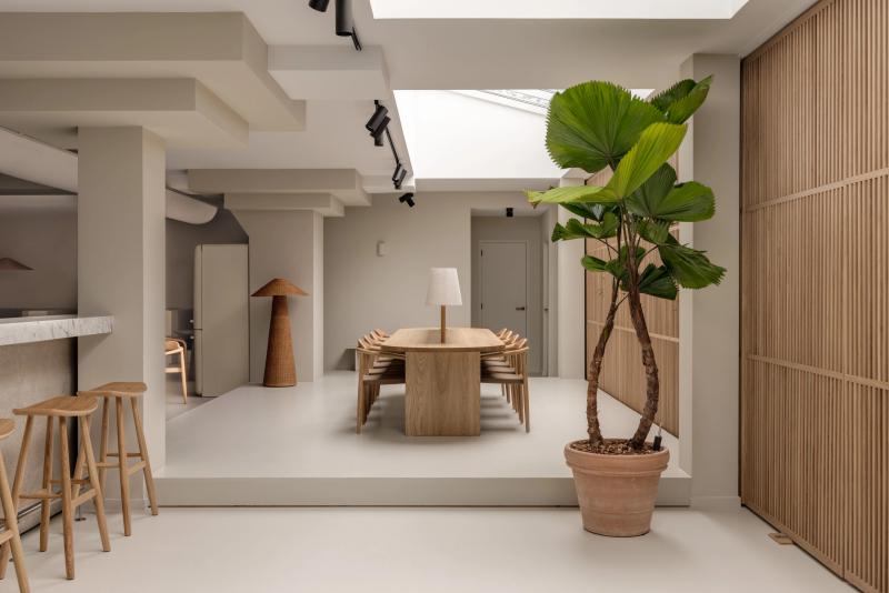
At & Agency, the layout works like a measured script. The room gives you one clear line of movement, then lets details accumulate at the edges. Junctions are clean and repeatable, which gives the small shifts in material a stronger effect. The project keeps the brief grounded in use: This interior cultivates a sense of effortless gathering where shared moments unfold in a calm, neutral landscape shaped. It lands through control, not spectacle. Proportion and material contrast carry the atmosphere from one frame to the next.
▪Spatial Priorities
Circulation clarity
Movement routes are kept legible so browsing, service, and dwell zones do not compete.
Front/back-of-house separation
Guest-facing sequences are coordinated with service paths to reduce operational friction.
Lighting hierarchy
Ambient, focal, and task lighting are balanced so materials read correctly without flattening depth.
▪Material Notes
Key Materials
Material cues referenced in the project text: Oak, Stainless Steel.
Color Reference
Image-derived palette baseline: Base #7D6853, Secondary #AB9B8D, Highlight #C7BAAE, Accent #5F4A35. Use as a visual reference and validate against material samples on site.
Finish Notes
Keep finish notes practical: identify high-touch surfaces, wear-prone edges, and cleaning-sensitive materials.
▪Delivery Scope
Concept Development
Spatial concept, layout direction, and design intent framing.
Material & Finish Specification
Selection and documentation of key finishes, fixtures, and surfaces.
Art Direction
Visual consistency across touchpoints, detailing, and spatial expression.
Execution Support
Technical intent communicated for procurement, fabrication, and site coordination.
Related projects