Eindhoven House

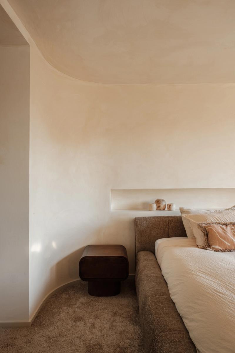
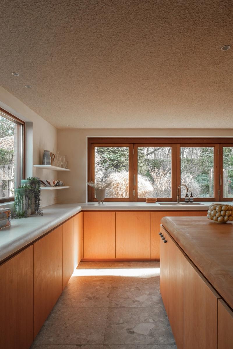
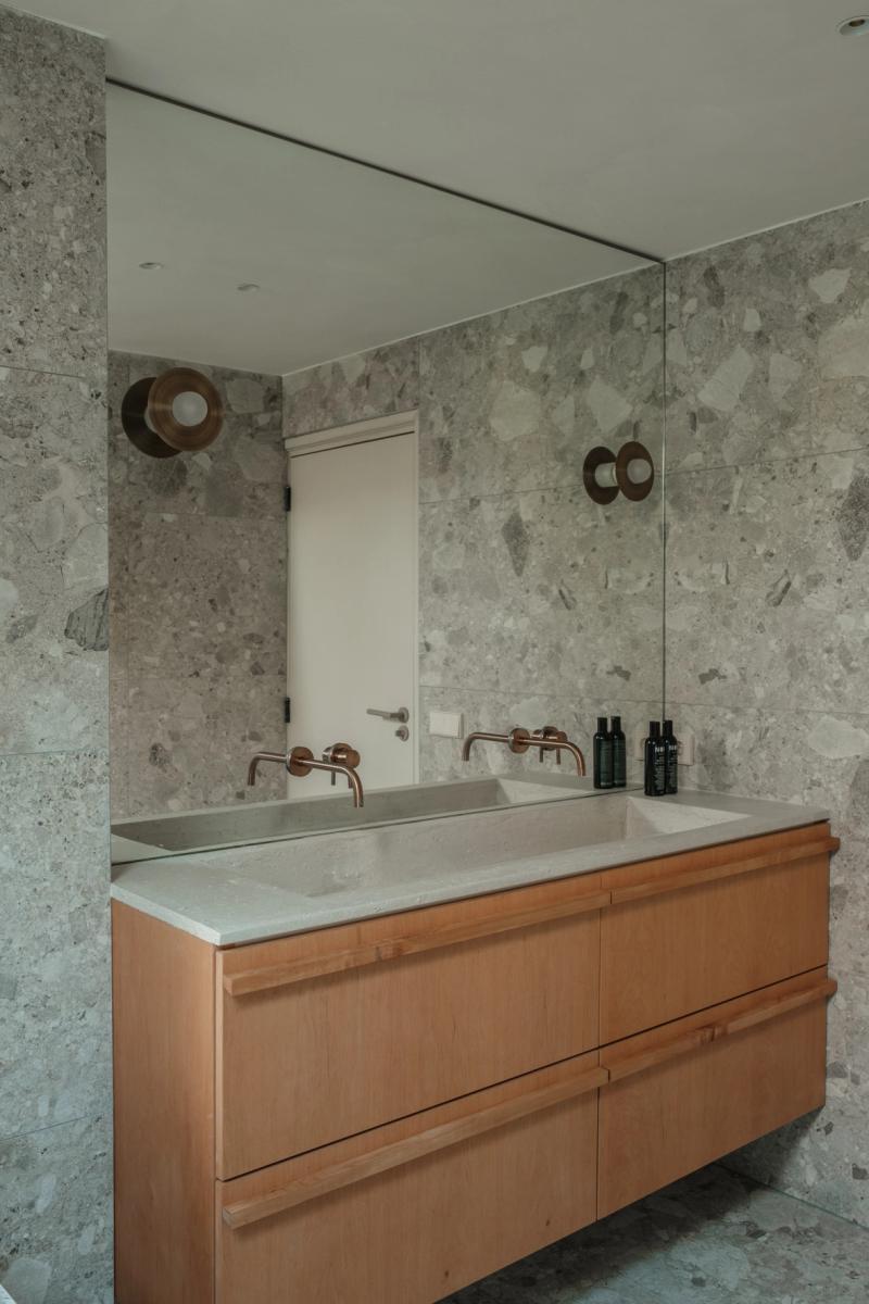
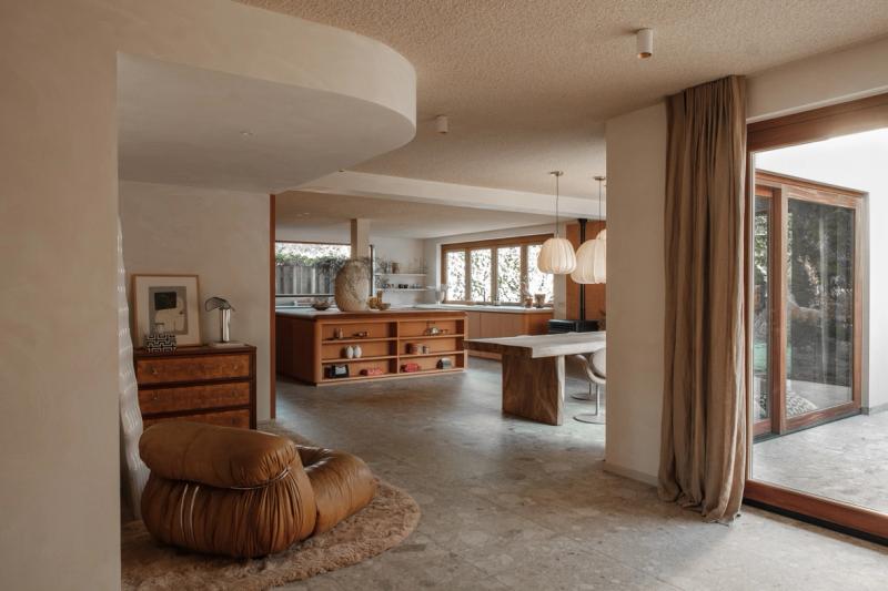
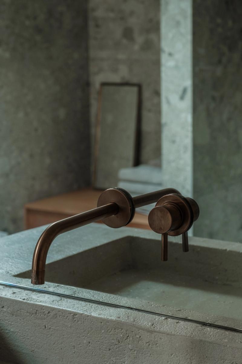
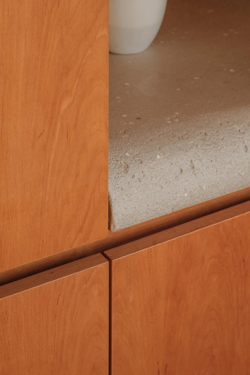
This residential interior balances clarity and warmth. Wide-plank oak runs through the main circulation line, while matte mineral finishes on walls and built-ins keep reflections controlled and daylight legible from morning to evening. The palette is restrained, but not flat; subtle texture carries most of the atmosphere.
The layout favors long views between rooms instead of hard separations. Joinery is detailed to sit flush with architectural lines, so storage remains present without becoming visual noise. Service functions are tucked into thicker wall zones, which keeps living areas open and adaptable.
Lighting strategy follows daily routines rather than dramatic effect. Soft ambient layers support general use, then narrower accents define kitchen work surfaces, reading corners, and transitions. The result is calm and durable, with enough detail to stay interesting over time.
▪Location
Ibiza, Spain
▪Sector
residential
▪Services
private-villa
▪Type
Eindhoven House
▪Palette
Base
#474C42
Secondary
#A28D7B
Highlight
#B0A799
Accent
#BA6834
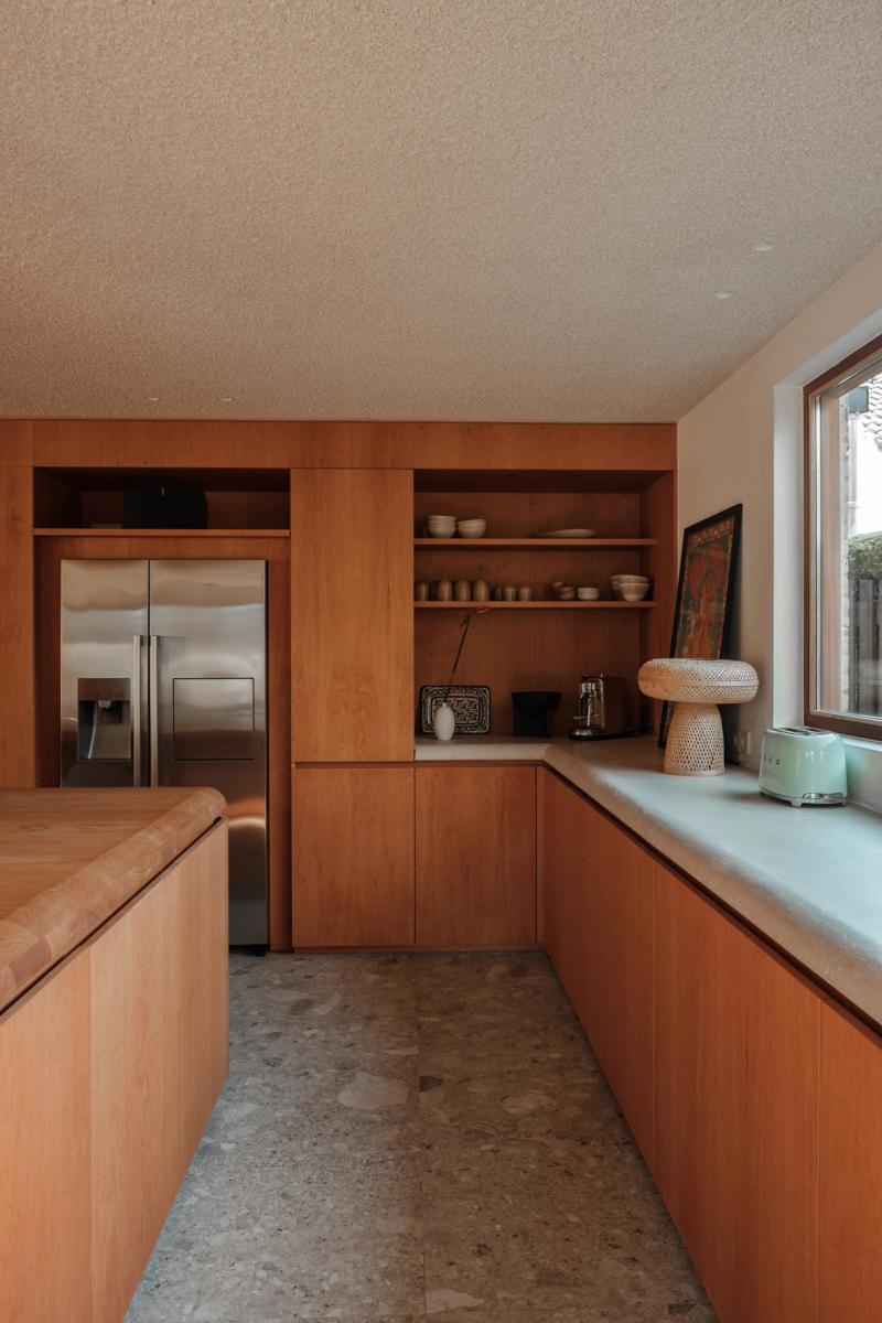
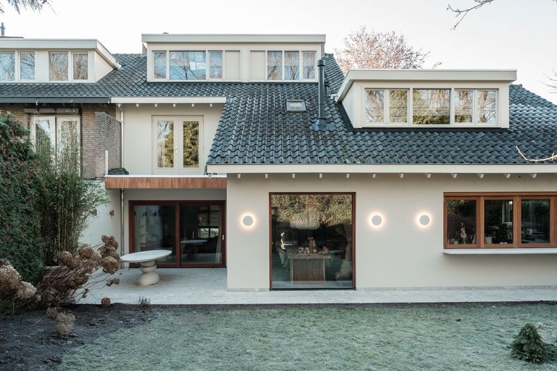
Eindhoven House reads as compact but deliberate. In Ibiza, Spain, the plan keeps circulation clear so the room can stay quiet even when it is active. Materials do most of the speaking: wide-plank oak, brushed stainless steel, and matte painted walls that keep reflections controlled. The project keeps the brief grounded in use: This residence embodies a quiet contemporary sensibility, where natural materiality and crafted detailing define a calm . The result is observational and precise. Nothing asks for attention, but everything is legible once you slow down.
The sequence feels edited rather than sparse. You move through Eindhoven House without friction, and each surface carries enough weight to hold the eye. Junctions are clean and repeatable, which gives the small shifts in material a stronger effect. The project keeps the brief grounded in use: This residence embodies a quiet contemporary sensibility, where natural materiality and crafted detailing define a calm . What stays with you is restraint. The project avoids gestures and leans on proportion, texture, and sequence instead.

At Eindhoven House, the layout works like a measured script. The room gives you one clear line of movement, then lets details accumulate at the edges. Junctions are clean and repeatable, which gives the small shifts in material a stronger effect. The project keeps the brief grounded in use: This residence embodies a quiet contemporary sensibility, where natural materiality and crafted detailing define a calm . It lands through control, not spectacle. Proportion and material contrast carry the atmosphere from one frame to the next.
▪Spatial Priorities
Circulation clarity
Movement routes are kept legible so browsing, service, and dwell zones do not compete.
Lighting hierarchy
Ambient, focal, and task lighting are balanced so materials read correctly without flattening depth.
Material readability
Surface changes are used to clarify zones, touchpoints, and pace rather than decorative effect.
▪Material Notes
Key Materials
Material cues referenced in the project text: Oak.
Color Reference
Image-derived palette baseline: Base #474C42, Secondary #A28D7B, Highlight #B0A799, Accent #BA6834. Use as a visual reference and validate against material samples on site.
Finish Notes
Keep finish notes practical: identify high-touch surfaces, wear-prone edges, and cleaning-sensitive materials.
▪Delivery Scope
Concept Development
Spatial concept, layout direction, and design intent framing.
Material & Finish Specification
Selection and documentation of key finishes, fixtures, and surfaces.
Art Direction
Visual consistency across touchpoints, detailing, and spatial expression.
Execution Support
Technical intent communicated for procurement, fabrication, and site coordination.
Related projects