NN.07 Gothenburg

NN.07 built its brand on a simple idea — personalities over nationalities , and the Gothenburg store tries to make that idea physical. It's a 150-square-metre space on a street that mixes independent cafés with older retail buildings, and the exterior gives you a hint of what's inside: a wide storefront with floor-to-ceiling glass, framed in dark patinated steel, that makes the interior feel like an extension of the sidewalk. There's no threshold drama. You just walk in.
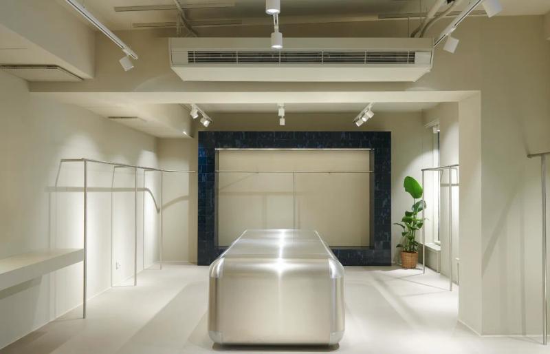
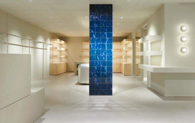
Inside, Reiters Wings set up the space as a series of loosely defined zones rather than a single open room. A long island unit in oiled walnut anchors the centre, its surface used for folded shirts and accessories laid out with enough space between each item that you can actually see them. Along the left wall, a system of blackened steel uprights and adjustable shelving holds outerwear and heavier pieces, while the right side drops down a single step into a lower area — almost a sunken living room , with a worn leather armchair, a stack of books, and a rack of the season's more considered pieces. It's the part of the store where you slow down.
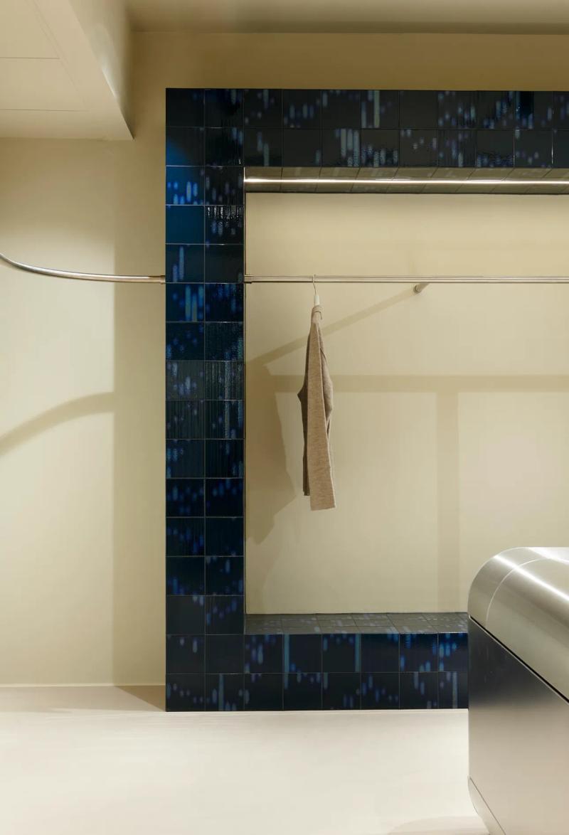
The material choices feel intentional without being overwrought. Polished concrete flooring throughout, softened by a large jute rug in the sunken zone. Walls in a matte off-white plaster, warm under the track lighting. The ceiling is exposed — painted ductwork and original beams left visible , which gives the room height and a sense of honesty that suits the brand. The fitting rooms at the back are simple: oak-framed cubicles with heavy cotton curtains and hooks made from bent brass rod. Even the cash desk , a slab of honed limestone on a steel frame , feels like it belongs in someone's home rather than a shop. The whole space communicates something specific: this is clothing for people who have things to do, not costumes for people who want to be seen.
▪Location
Gothenburg, Sweden
▪Sector
retail
▪Services
concept-store, showroom
▪Type
NN07
▪Surface
150 m²
▪Creative Director
Reiters Wings
▪Project Manager
Tomai Nordgren
▪Palette
Base
#1D2527
Secondary
#A9A38B
Highlight
#C8C2AE
Accent
#998E72
NN.07 Gothenburg reads as compact but deliberate. In Gothenburg, the plan keeps circulation clear so the room can stay quiet even when it is active. Materials do most of the speaking: wide-plank oak, brushed stainless steel, and matte painted walls that keep reflections controlled. The project keeps the brief grounded in use: NN.07 built its brand on a simple idea — personalities over nationalities — and the Gothenburg store tries to make that . The result is observational and precise. Nothing asks for attention, but everything is legible once you slow down.
The sequence feels edited rather than sparse. You move through NN.07 Gothenburg without friction, and each surface carries enough weight to hold the eye. Junctions are clean and repeatable, which gives the small shifts in material a stronger effect. The project keeps the brief grounded in use: NN.07 built its brand on a simple idea — personalities over nationalities — and the Gothenburg store tries to make that . What stays with you is restraint. The project avoids gestures and leans on proportion, texture, and sequence instead.
At NN.07 Gothenburg, the layout works like a measured script. The room gives you one clear line of movement, then lets details accumulate at the edges. Junctions are clean and repeatable, which gives the small shifts in material a stronger effect. The project keeps the brief grounded in use: NN.07 built its brand on a simple idea — personalities over nationalities — and the Gothenburg store tries to make that . It lands through control, not spectacle. Proportion and material contrast carry the atmosphere from one frame to the next.
▪Spatial Priorities
Circulation clarity
Movement routes are kept legible so browsing, service, and dwell zones do not compete.
Sightline control
Displays and focal points are arranged to maintain visibility while preserving rhythm through the space.
Lighting hierarchy
Ambient, focal, and task lighting are balanced so materials read correctly without flattening depth.
▪Material Notes
Key Materials
Material cues referenced in the project text: Oak, Walnut, Limestone, Concrete, Stainless Steel, Brass.
Color Reference
Image-derived palette baseline: Base #1D2527, Secondary #A9A38B, Highlight #C8C2AE, Accent #998E72. Use as a visual reference and validate against material samples on site.
Finish Notes
Keep finish notes practical: identify high-touch surfaces, wear-prone edges, and cleaning-sensitive materials.
▪Delivery Scope
Concept Development
Spatial concept, layout direction, and design intent framing.
Material & Finish Specification
Selection and documentation of key finishes, fixtures, and surfaces.
Art Direction
Visual consistency across touchpoints, detailing, and spatial expression.
Merchandising / Display Logic
Display zones and fixture priorities coordinated with circulation and visibility.
Related projects